Dano Williams
Dano Williams is a designer in North Adams, Massachusetts and Portland, Oregon.
Case study The Berkman Center for Internet & Society History data visualization
Project Overview
The Client
The Berkman Center for Internet & Society is a university center based at Harvard University. Since 1997, the Center has studied the legal and sociopolitical impact of the Internet. It was developed to have an entrepreneurial focus and values active engagement with the Internet — projects and code rather than position papers and passive research. The strength of the Center is its network of fellows and associates who come to the Center not for compensation, but for the opportunity to learn from each other and pursue their individual and collaborative projects.
Project Objectives
Create a printed prospectus to communicate the history and vitality of the Center to potential donors, fellows, and interested students. The attention-grabbing showpiece of this prospectus would be a visualization of the many important contributions the Center has made to the history of the Internet, told through the story of the Center’s 20 years of independent projects.
Initial Constraints
- Material: Printed piece
- Limited data set: the only data common to every project was duration, description, and a rough taxonomy of type. Collecting additional data would be time consuming and its vetting could be problematic.
- Institutional constraints: Non-hierarchy, even-handedness, fairness, modesty. Each project has its own stakeholders with their own objectives and priorities.
The Center’s Vision
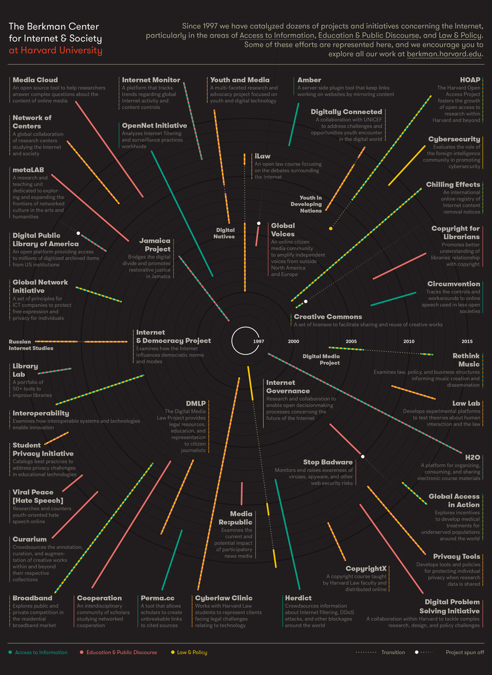
The Center came to the project with the idea of presenting its projects as a network of subway lines (a transit graph), with three levels of representation: projects (stops); subject categories (lines); and pedagogic modes (geographic areas).
1: Discovery and story analysis
I held a number of discussions with the communications team and also attended larger staff meetings to get a sense of the Center: its organizational culture, tone, decision-making process, and self image. It quickly became clear that the academic and research strengths of the Center — multiple autonomous teams with their own members and priorities, and a widely dispersed, collaborative, non-hierarchical organizational structure — made central decision making challenging. It was difficult for the Center to define a coherent idea of itself — almost every definition had caveats and exceptions. The Center was resistant to organizational self-definition as limited and limiting. Identity was an emergent property, only visible in the aggregate.
It felt important that the visualization make this aggregate identity explicit, and that what emerged could form a motif for the rest of the prospectus. I imagined the Center as something that you could only see through action and implication. Like negative space, or the concentric rings radiating from a stone dropped in water — the Center was both the stone and the rings, the literal center defined by its dynamic effect through time. Concentric rings, thus, are a natural indicator of time as well as dynamism. This was both a good story and a useful graph.
The Center’s initial transit graph metaphor had a few key weaknesses:
- The transit graph metaphor is very strong and distinctive. Without a strong correlation between the data and transit, the metaphor can overwhelm and appear gimmicky.
- Our primary data were duration, and the transit graph doesn’t communicate duration as easily as taxonomy and sequence.
- The taxonomical data were pretty squishy. A transit graph is defined not only its lines but its intersections — how our projects were categorized would form the shape of the lines and intersections, and these relationships were subject to possibly endless discussion. The core structure should be something more objective.
- The transit graph carries the idea of sunk infrastructure — lines that are built and fixed in time. We needed to show that the Center is alive and growing.
We agreed that we wanted our story to focus on the continued dynamism of the Center and how each project is both an example of that dynamism and a component of a larger dynamic. We agreed to proceed with a radial timeline, with projects shown as rays.
2: Initial Sketches
Sketching revealed that the radial graph couldn’t have a strong background of its own. If it displayed with too much contrast, its circularity was a distraction, reading as a plate, record, or compact disc, self-contained rather than extending into the future.
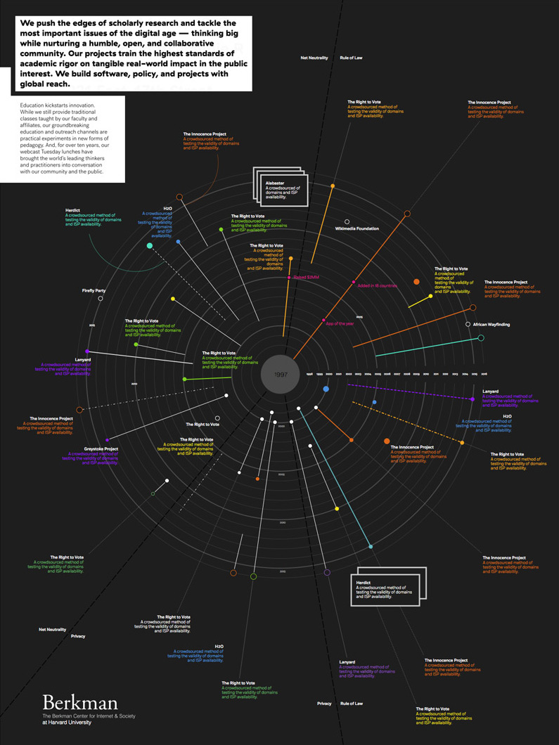
Strong markers (i.e. dots) at the end of each project ray also added a level of complexity that might need to be explained. A strong marker at the beginning seemed clear enough as the indication of the start of a project, but did we need a distinction between a beginning marker and an end marker? What about projects that are ongoing? Would they have no end marker or a different kind? Markers at the beginning but not the end had the unpleasant effect of reversing the ray’s direction, evoking a sperm cell moving inward rather than energy radiating outward. The markers also began to define a cartesian field of their own that could potentially distract from the project rays. Markers provided a good anchor for a pointer, and an obvious focal point for the viewer, but their presence required balance.
It was going to be difficult to get all the projects and their content on the page and keep the focus clear.
3: First pass, feedback, and refinement
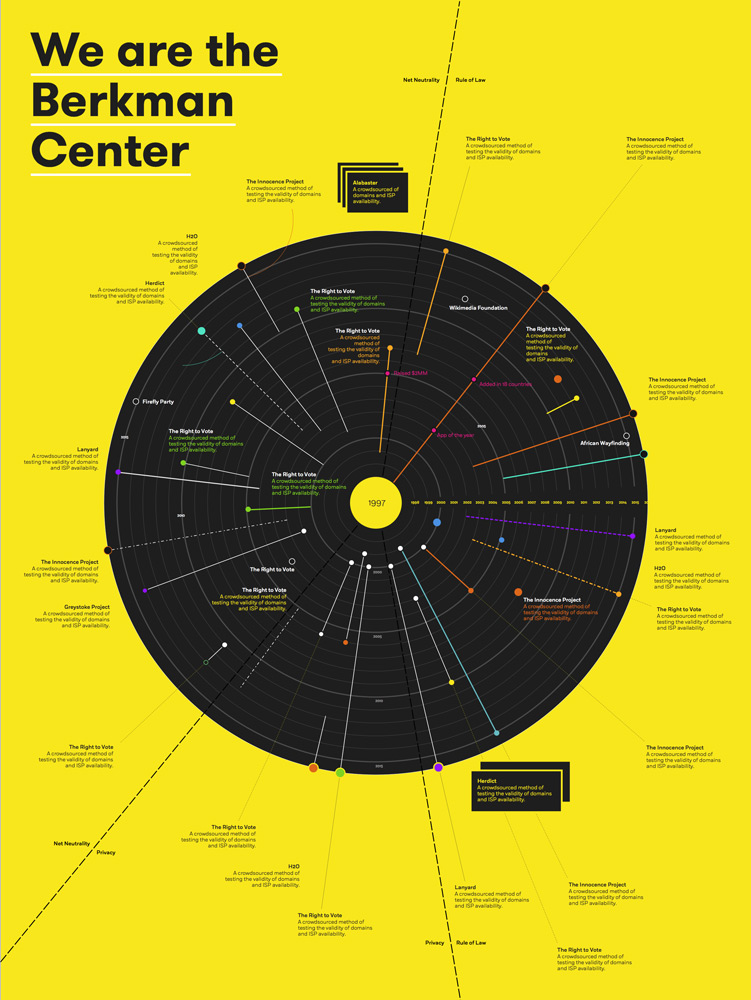
I was pleased with the first refined pass of the visualization. It had a good overall balance, the project subject and pedagogical modes were both clear and neither overwhelmed the other. We had a consistent treatment for markers (white on the start side and filled with the subject color on the end side). The overall piece had what you might call “sparkle” or inviting contrast. The visualization motif also worked well as a cover motif, abstract but energetic and evocative.
The first round of feedback revealed some weaknesses in the visualization and a clarification of the Center’s institutional priorities.
The two levels of categorization (subject and pedagogic mode) were causing internal anxiety at the Center over their definition and application. They could not agree on each project’s subject categorization and decided that the subject level would have to be scrapped. While this allowed us to minimize or remove the mode indicator in the background color, it also meant losing a key project differentiator: the color in the project name. Since projects could exist in different modes, a single color couldn’t easily represent multiple modes. Blended colors (green as a mix of yellow and blue) were not only ambiguous, but made the visualization look like a rainbow and felt juvenile. A multicolor title wasn’t a good option.
The Center decided that each project needed to have a description, and none of them would include milestones. While there was a visual benefit to different levels of project treatment, as well as limited space for additional text, it was critically important to the Center that each project be treated similarly. Favoritism, even at the level of visual distinction, was going to be a political problem. I would need to get more copy on the visualization, make the projects similar, and provide contrast in another way.
Continuing projects were also a problem. They weren’t reading clearly, and there was an ambiguity between continuing projects (those that extended to the circumference of the disc) and the label pointers (the dotted lines that connected a project name/description to a ray). The pointers looked more like continuations because they extended past the circumference of the disc.
And finally, the Center needed to include a small piece of explanatory text somewhere on the image to explain the context of the pedagogical modes.
This feedback introduced a few major new constraints and content elements, the effect of which could be to flatten the contrast of the piece and reduce it to a cloud of text. Back to the drawing board.
4: Second pass (flexibility and rigidity)
We needed to get a lot more text on the page and present each project with less individual distinction. Neither of these new constraints were negotiable.
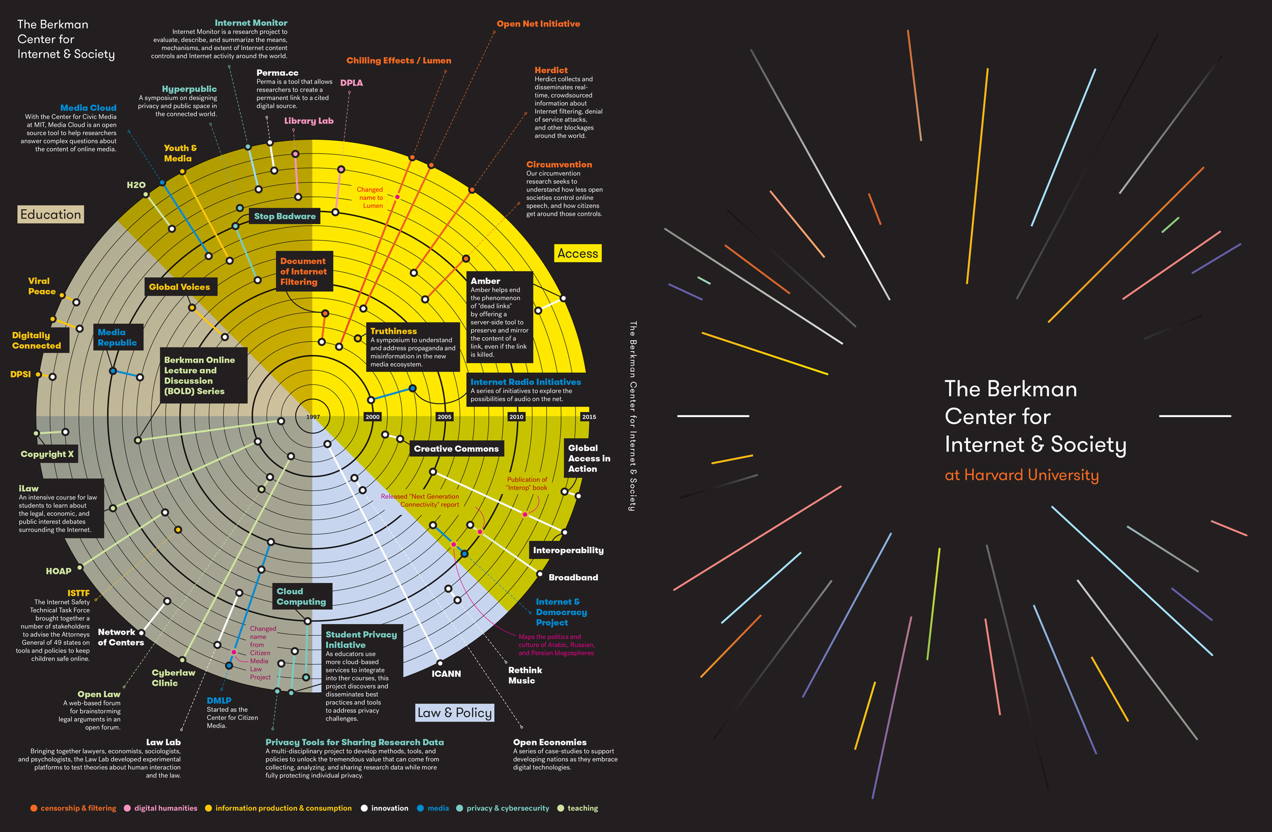
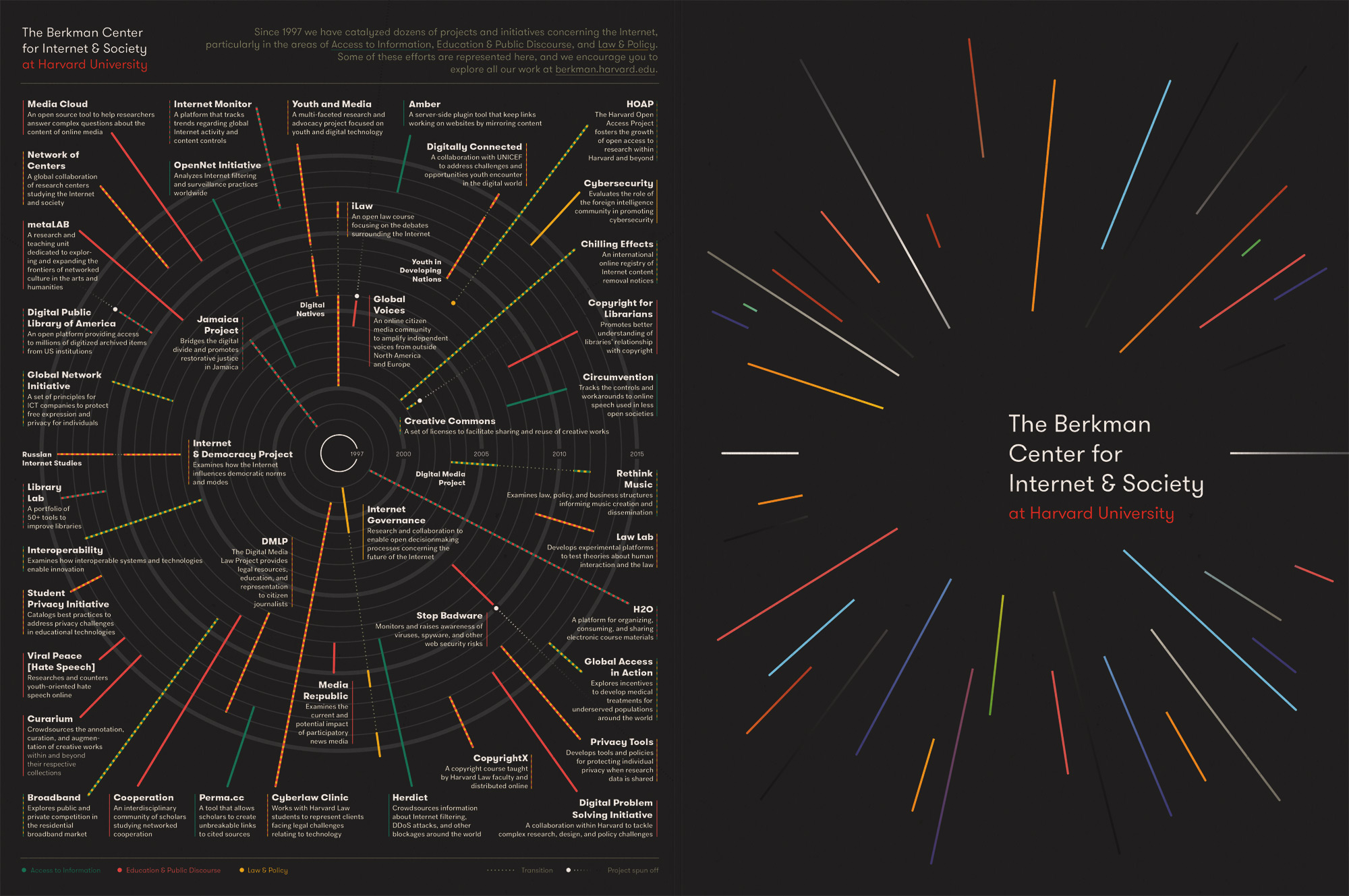
On the bright side, the visualization told the story well, and the motif successfully unified the entire prospectus. I needed to strengthen the motif and establish visual hierarchy through other means. If the concept of the visualization could influence the direction of the cover motif, could the direction of the cover motif feed back and influence the visualization?
Part of the cover’s strength comes from its simplicity — the strength of the rays against an empty background. I could apply this to the visualization by thickening the project rays and reducing the visual weight of the background graph. This solved a number of the new constraints by strengthening the motif, removing the ambiguity of the markers, and allowing continuing projects to extend beyond the circumference of the graph — a clearer indication of their continued activity.
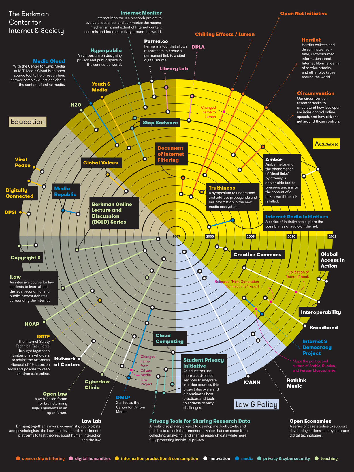
My experience in book design indicated that it would be possible to print the visualization graph as rich black on 100%K black. The rays could be solid lines for single pedagogic modes, and alternating square dashes for multiple modes. Every project, then, would be a single ray with a similar treatment. Trial and error revealed a suite of colors that worked well both as single colors and alternating combinations. We also had the opportunity to add new patterns for periods of project hiatus (a thin dotted line) and for instances when the project spun off from the Center (a wide-dashed white-to-rich-black gradient line that extended outside the graph to the edge of the page).
The new ray treatment had great energy. Now I could contrast the strong diagonals of the rays with a rigid grid of project text. This difference in structure could provide the balance the piece needed. The final touch was the “service ribbon,” a thin line with the same mode pattern as the project ray that appears next to the project name and description to connect it visually to the project ray and allow a faster read of the project’s mode.
This treatment got great feedback from the Center, so it was off to print!
5: Adapting to print
When the first proofs returned form the printer, everything looked beautiful — except that the gridlines completely vanished and the project descriptions were printing with a nearly unreadable line screen! Clearly, this wasn’t acceptable.
Further discussion with the printer revealed that the black-on-black printing wasn’t going to work, despite my experience otherwise. But it is rarely in your favor to go against your printer’s recommendations — having a representative on your side at the printer who believes in the project and knows how to make it perform at its best is more important than almost any other consideration. The Center didn’t have the budget to perform the battery of press tests required to be certain. The printer suggested not only changing the gridlines to gray, but increasing their weight, and also lightening the color of the project descriptions.
Thus I found myself in a situation not unlike that of Jørgon Leth in his The Five Obstructions, where Leth is tasked with directing a simple story while a sadistic Lars von Trier adds increasingly strange and challenging structural restrictions!
At this point, though, it was important to trust the printer and trust that I could make the final balance work. In the end, after following the printer’s guidelines and balancing the relative weights of the gridlines, rays, and descriptions, it hit the press and worked!
6: Conclusion
Design often comes down to balance — visual balance, of course, but also a balance between expectations and practicalities, and the complete matrix of strengths and weaknesses that determines the overall shape of design. Design thinking doesn’t set out to make everyone happy, rather to strike the best balance between the needs of each class of stakeholder — client, user, and fabricator. While the user is the most important of the three, the constraints set by the other two can’t be ignored. There can be disagreements along the way, but the most important through line is a story that makes sense to the client, appeals to a user, and can be built by a fabricator. In the case of the Berkman Center, their dynamic history suggested the shape of a story that’s only gotten stronger when faced with multiple, overlapping constraints.
That’s a success story.
Return to Projects