Dano Williams is a designer in Portland, Oregon.
Selected Projects
- Product management and design
- Front-end development
- Leadership
- Typeface design
- Front-end development
- Print design
- Information design
- Data visualization
- Icon design
- Front-end development
- Content strategy
- Logo design
- Icons/UI
- Front-end development
- Web app
- Content strategy
- Icons/UI
- Front-end development
- Content strategy
- Icons/UI
- Book design
- Identity
- Illustration
The United States Web Design System
-
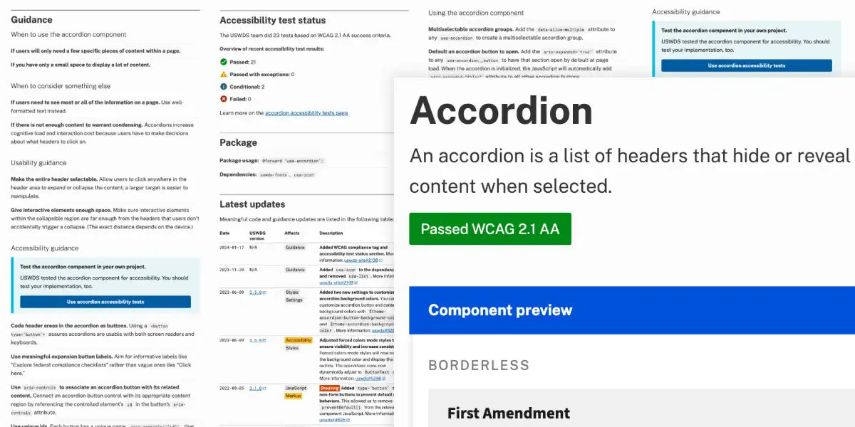
Above: USWDS components include complete usage guidance — from accessibility to settings, customization, and latest updates. -
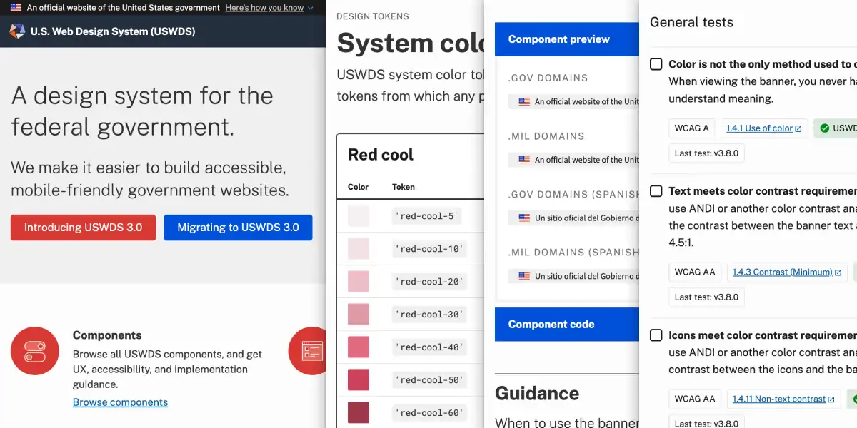
Above: USWDS provides principles, guidance, and code for building websites and services for the United States federal government. -
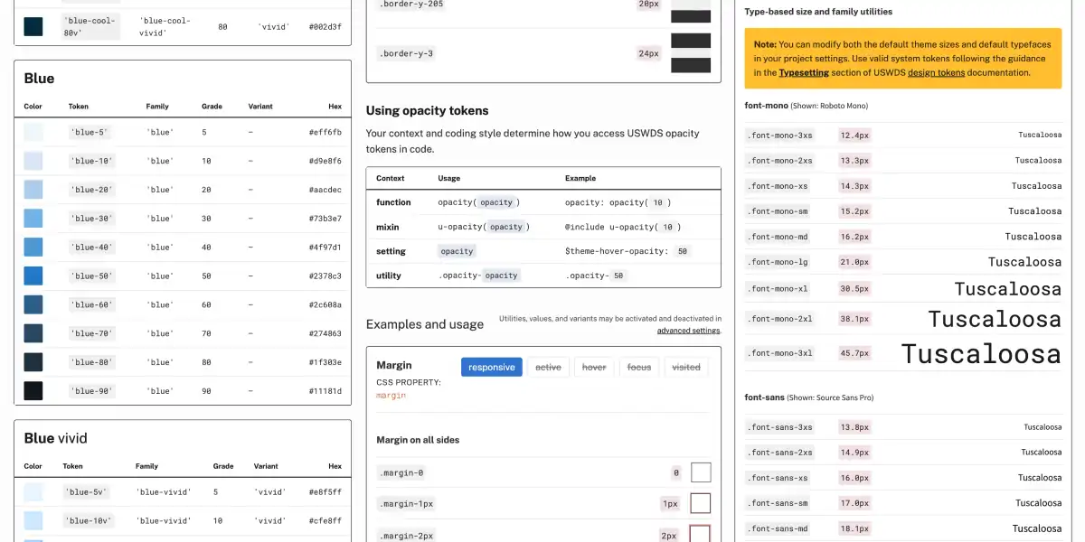
Above: USWDS was one of the first major design systems to use a expressive language of design tokens. -
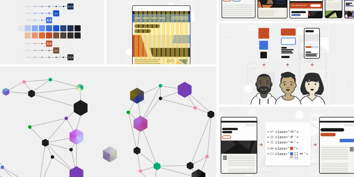
Above: I created a consistent visual tone for the design system. -
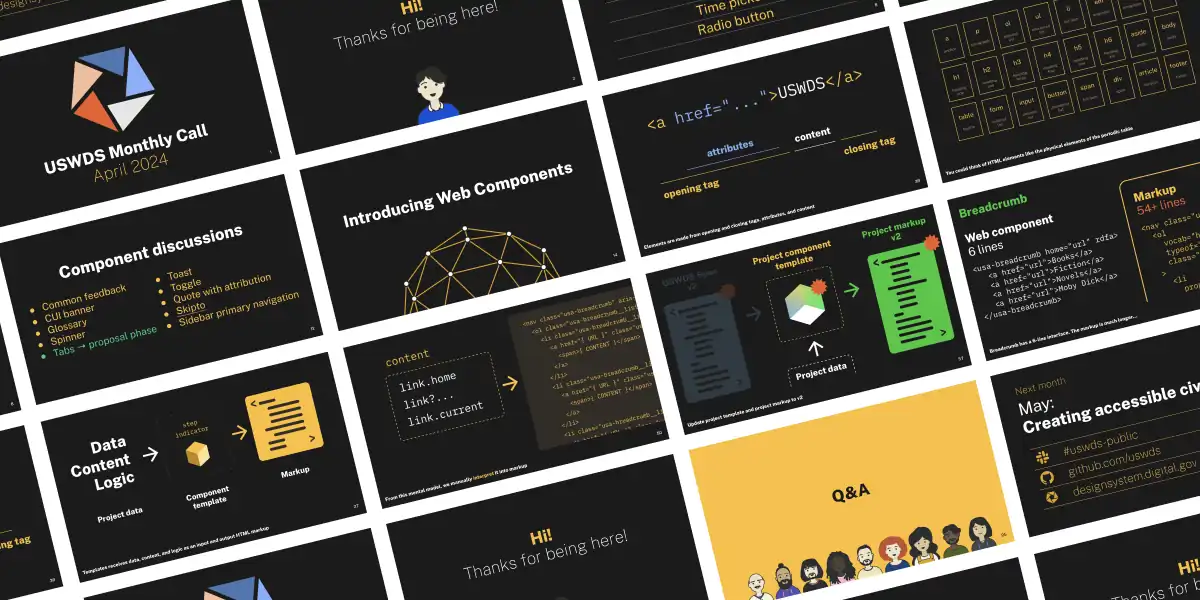
Above: I wrote and designed over seven years of public, hourlong monthly calls to help educate and connect federal digital practitioners.
Over eight years and three presidential administrations, I served as Project Lead for the federal government's design system, USWDS, helping it grow from a recently-released 1.0 product to a stable, mature, and trustworthy open source tool at the cusp of its fourth major version. I lead the team through a period of significant transition, designing and building the USWDS website, developing its strategy, hiring staff and structuring contracts, and working to grow a community of practioners around shared principles and the values of human centered design. We developed a strong commitment to working in the open. We managed the product in GitHub, produced hourlong monthly public presentions, and delivered regular releases to the codebase. Our commitment to accessibility is resulting in services that reduce the barriers to participation across the federal government, and is a model for state, local, and tribal governments, as well as the private sector.
Public Sans typeface
-
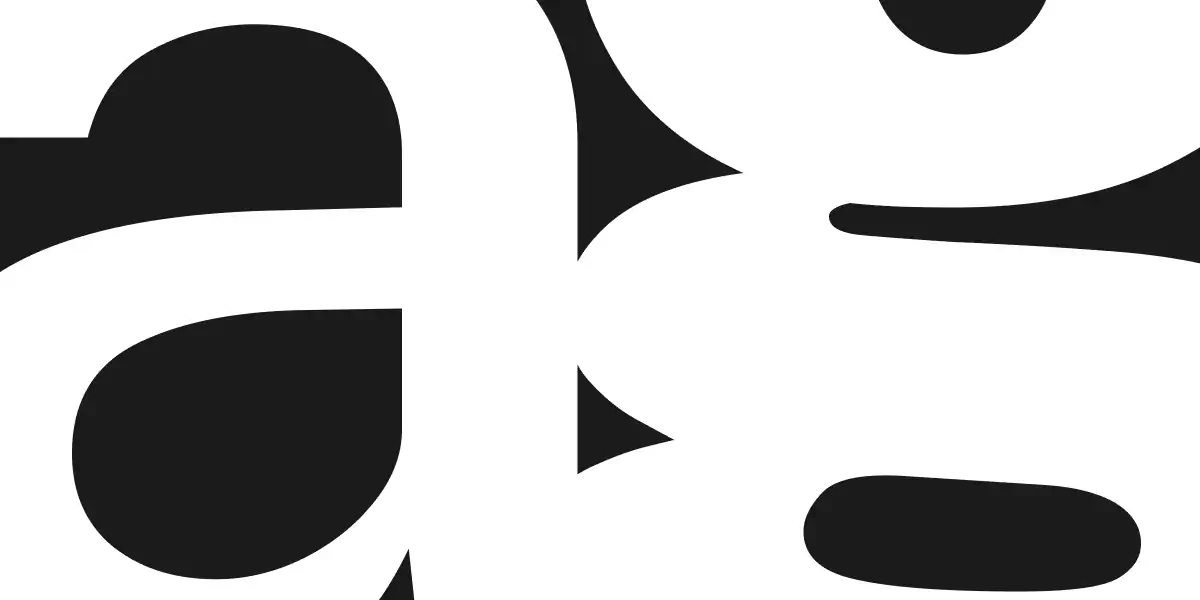
Above: A detail of Public Sans letterforms. -
Above: Public Sans is a strong, neutral typeface for interfaces, text, and headings, developed for the United States federal government. -
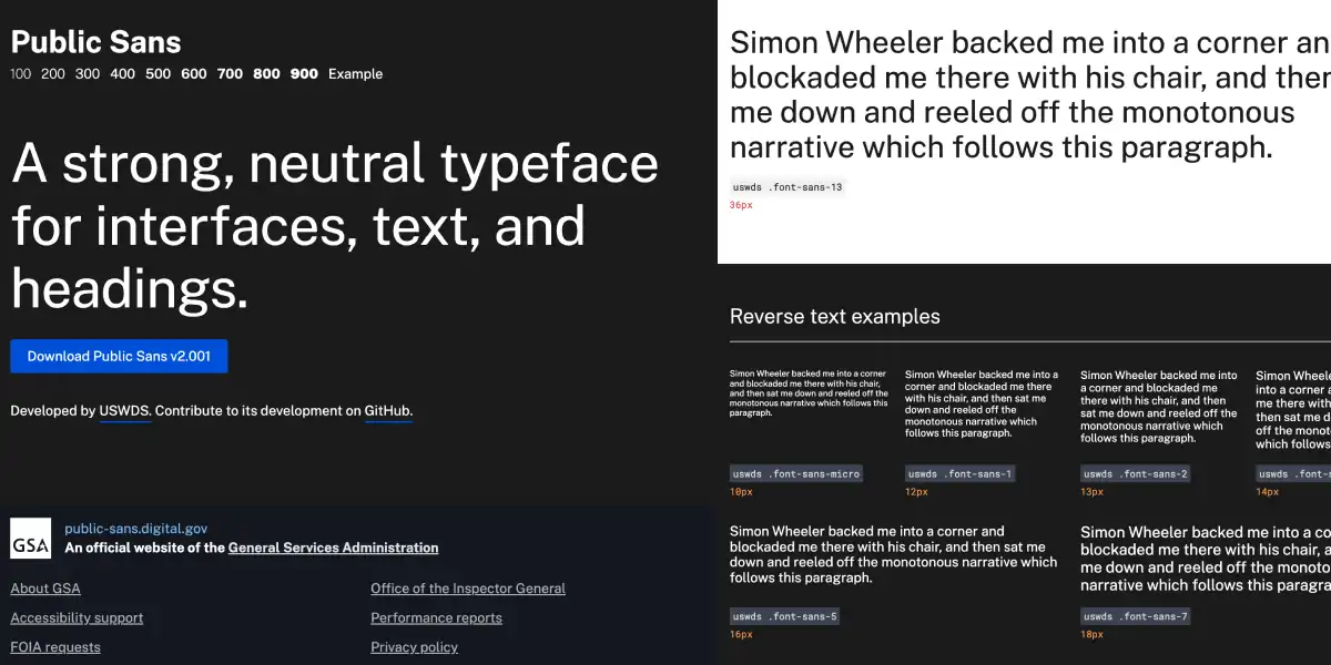
Above: The Public Sans specimen website includes examples of different styles and weights.
While working at 18F and USWDS, I adapted an existing open source typeface, Libre Franklin, into a full-featured neutral sans serif, suitable for the United States federal government. This variable font includes nine weights from thin to black, an italic, and significant international language support. With distribution both in a Public Sans GitHub repo and through services like Google Fonts, Public Sans has found widespread adoption beyond government.
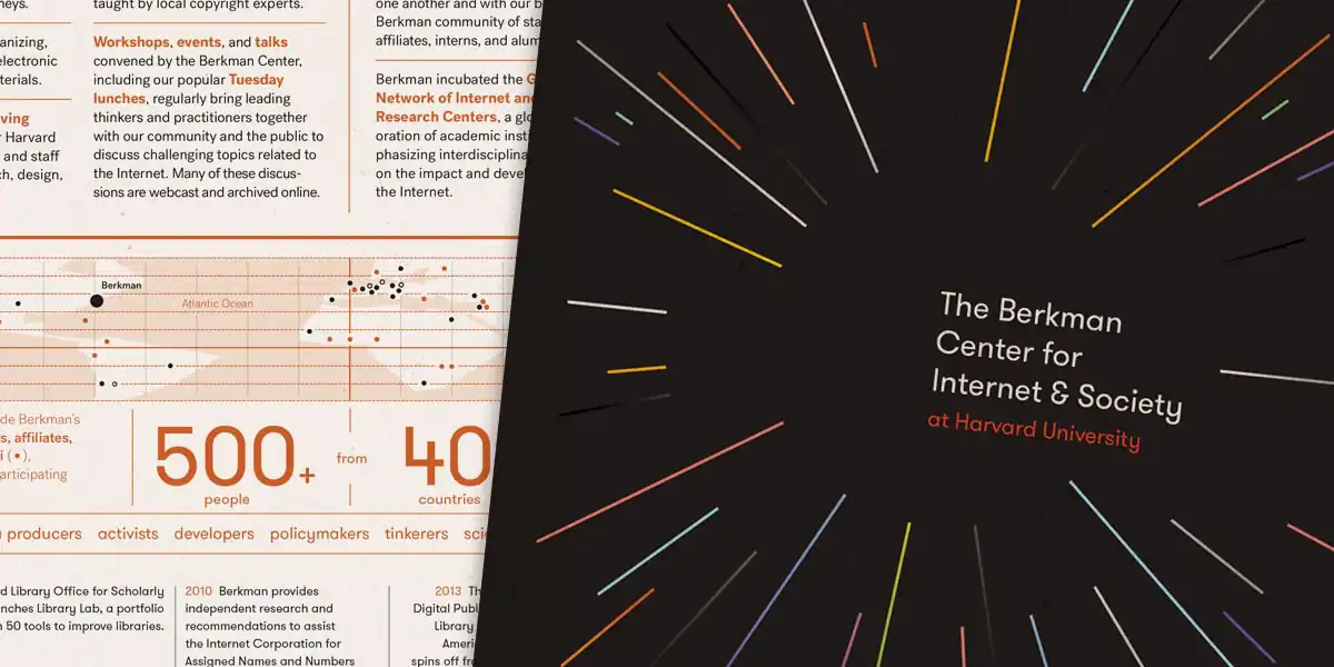
The Berkman Center for Internet & Society prospectus
-
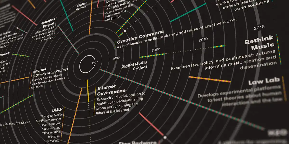
Above: A concise, visually stunning history of the Center’s projects. -
Above: The motif of a radiant center. -
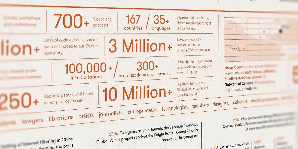
Above: Statistics deepen the Center’s story.
The Berkman Center for Internet & Society (now the Berkman Klein Center for Internet & Society) is one of the oldest and most respected insitutions devoted to the study of the Internet and an open web. Creative Commons, Chilling Effects, Wikipedia, and the podcast can all trace their development through the Center. This new prospectus communicates the Berkman Center’s history and values through the motif of a radiant center — both as pure image and as practical infographic — an image of a rigorous, exciting, and limitless academic environment.
Library Innovation Lab website and identity
-
Above: Simple typography and bold colors. -
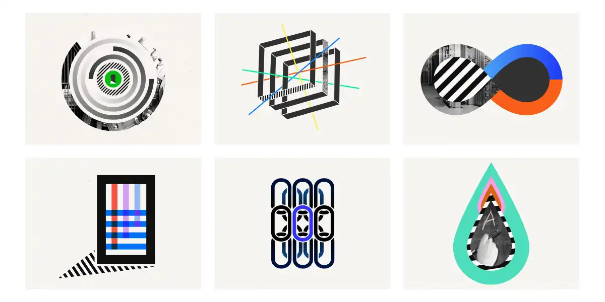
Above: Project icons conect to the overall identity. -
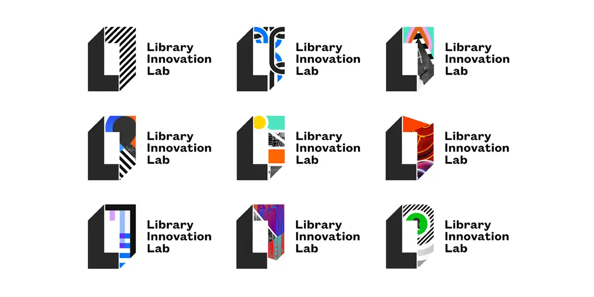
Above: Logo variations adapt to mutiple contexts. -
Above: The website features a responsive, mobile-first design.
The future doesn’t always have to destroy or disrupt the past. It can build on it, strengthen it, and discover its forgotten strengths and successes. Harvard’s Library Innovation Lab is a brilliant example of the critical role for traditional infrastructure — libraries, academia, and other noncommercial institutions of public knowledge — in the digital future. I was fortunate to join their smart, passionate team as a Designer-in-Residence for 2015. Together we built a new website and identity system to communicate the Lab’s impressive smarts, vitality, and breadth of accomplishment.
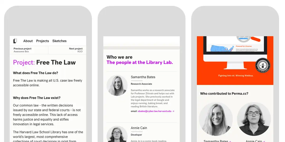
Perma.cc redesign
-
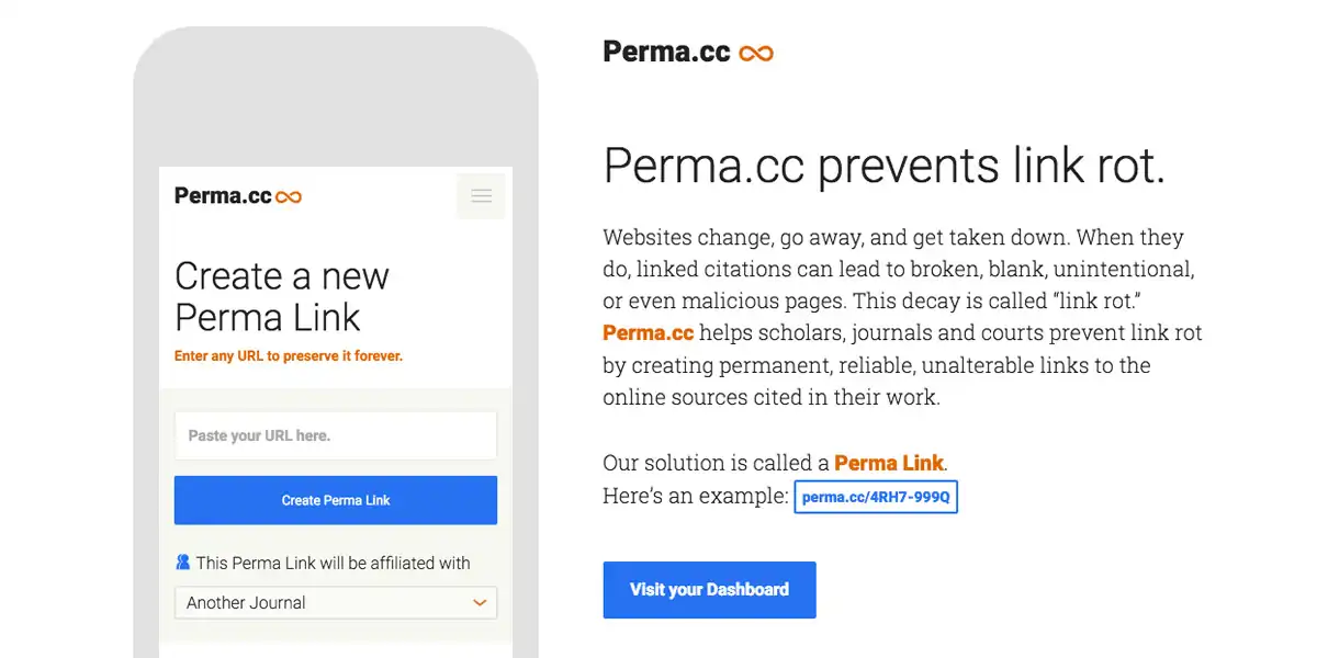
Above: Content strategy is at the core of the overall product strategy. -
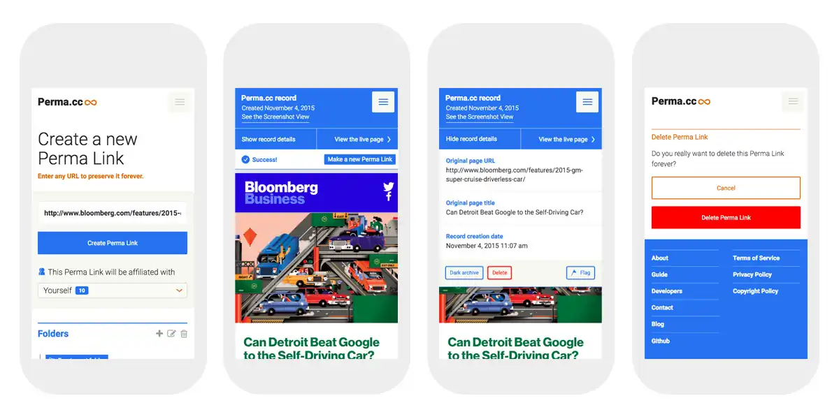
Above: Simplified flows for common tasks. -
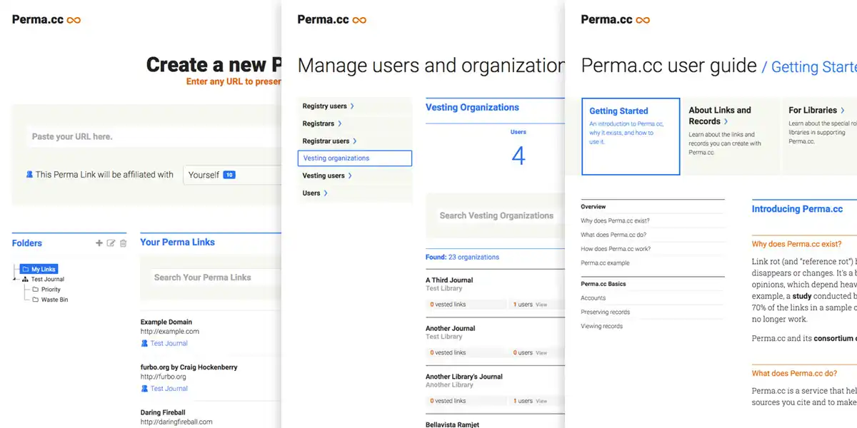
Above: Streamlined UI, and a more consistent user experience.
Link rot kills academic citations and Perma.cc stops link rot. Harvard’s Library Innovation Lab developed Perma.cc to provide scholars and legal professionals a way to create permanent, reliable, unbreakable links to the digital sources cited in their work. This redesign helped the Lab take a hard look at the Perma.cc’s usability, making the core functionality more consistent and predictable. We looked at the typefaces, colors, and button shapes, but — just as importantly — at the language system at the center of the overall product definition. We built a trustworthy responsive design to take Perma.cc from a promising beta to a polished web application.
nplusonemag.com site design
-
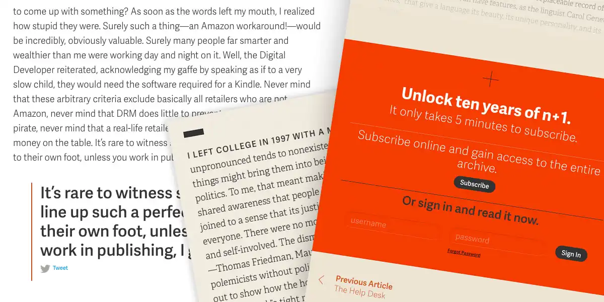
Above: A focus on detail and typography. -
Above: Modules form the basis of the article discovery model. -
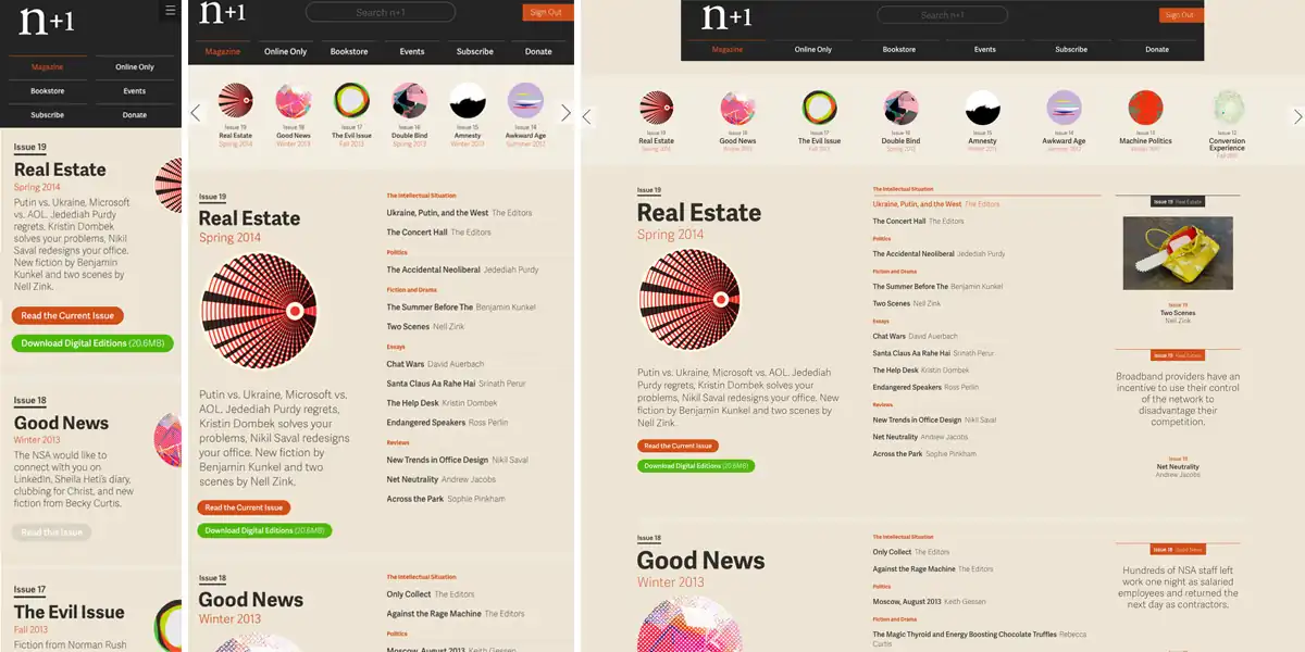
Above: Consistent experience across devices. -
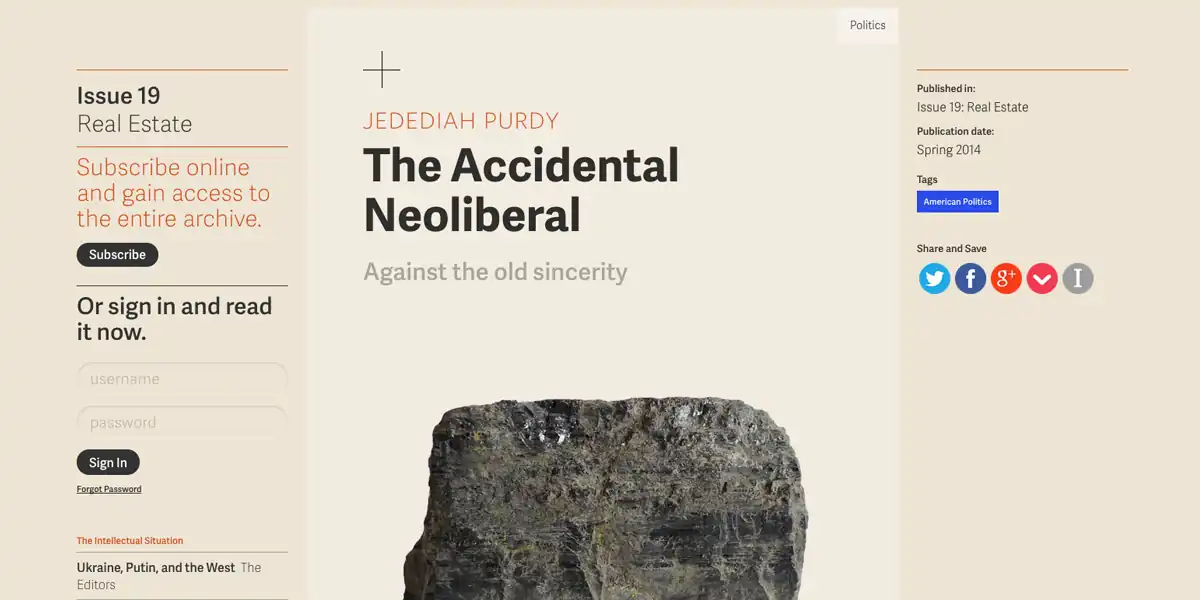
Above: Articles built for longform reading. -
Above: A complete publication suite. -
Above: The canonical version of the magazine is online.
2014’s redesign (now over ten years old) was a fundamental change for n+1: now the canonical version of the magazine is online. The digital-first redesign allowed n+1 to continue its free web-only articles while adding a new paid online subscription level. The new interactive experience was informed by a detailed content strategy that analyzed the components of the publication and a design strategy that put the reading experience first.
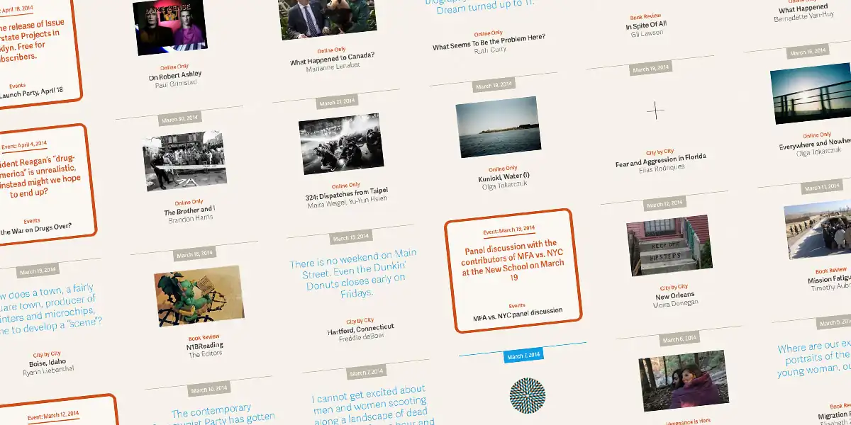
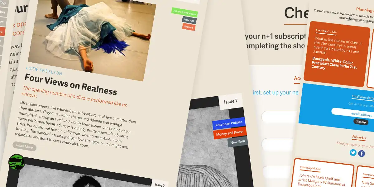
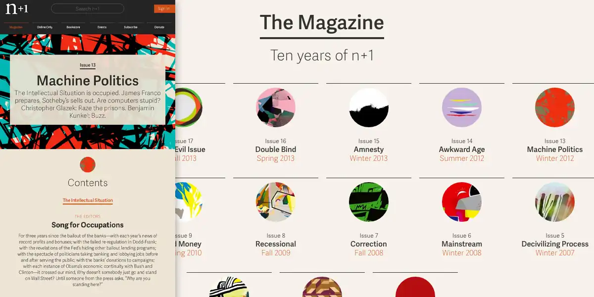
n+1 publication system
-
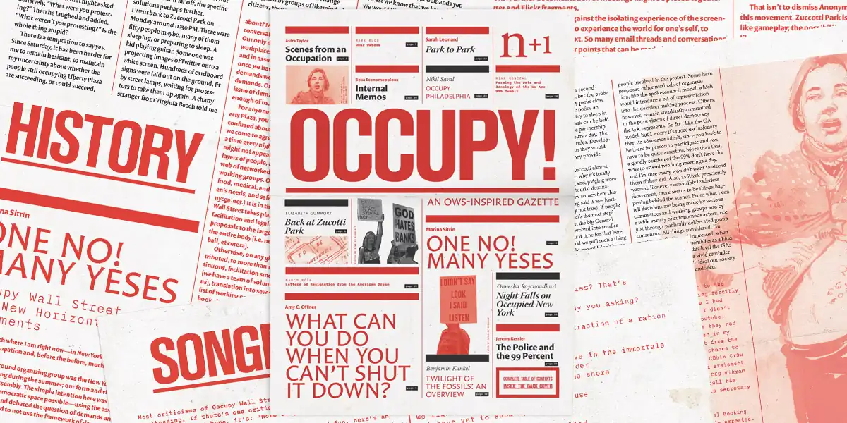
Above: Occupy! issue 1 (2011). Typefaces: Versa Sans, Nitti, Berthold Akzidenz Grotesk -
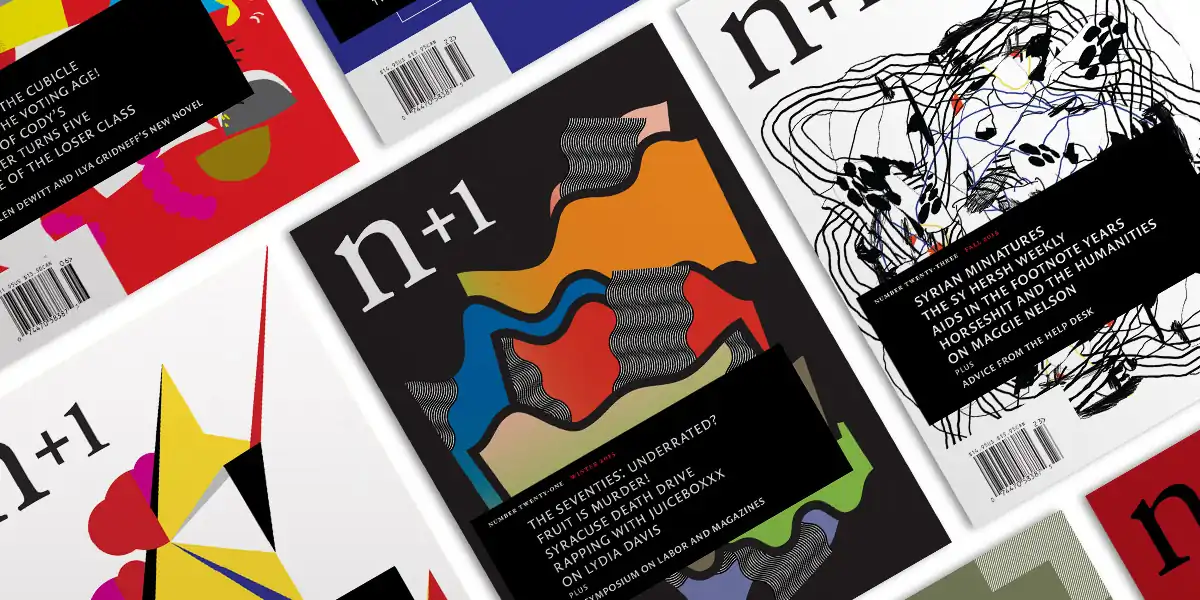
Above: n+1 magazine publication design, with original illustrations. -
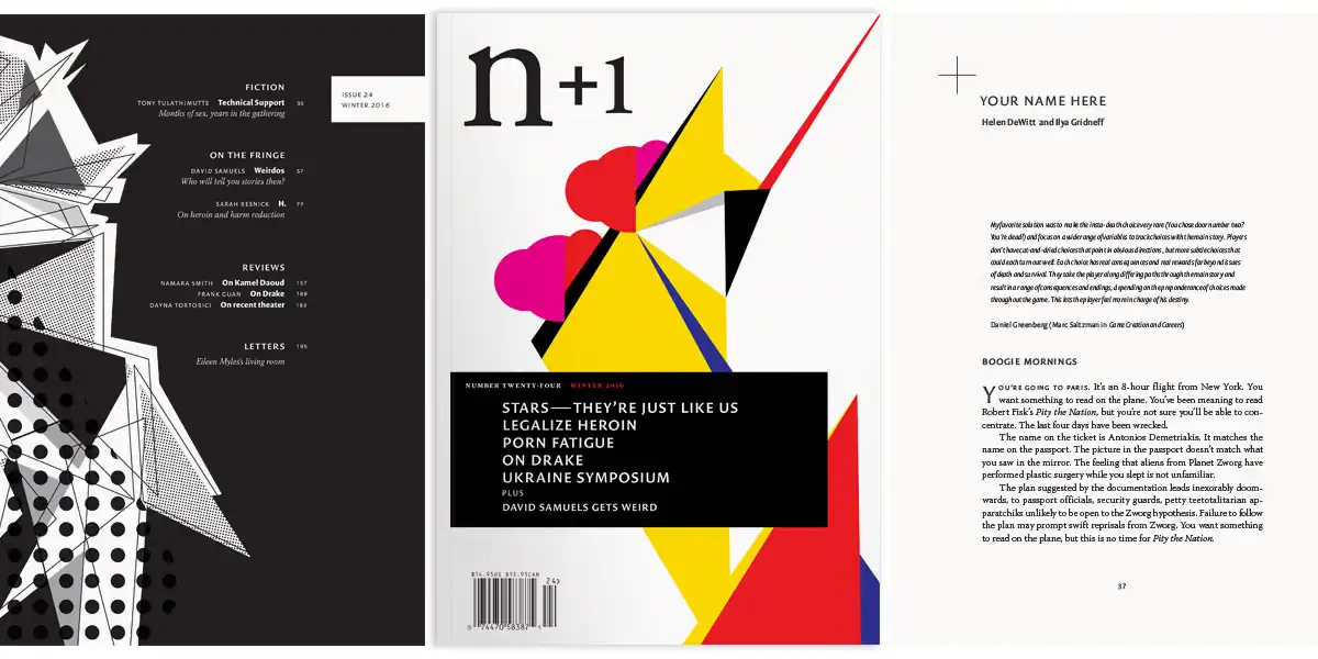
Above: Number 24: New Age (2016). -
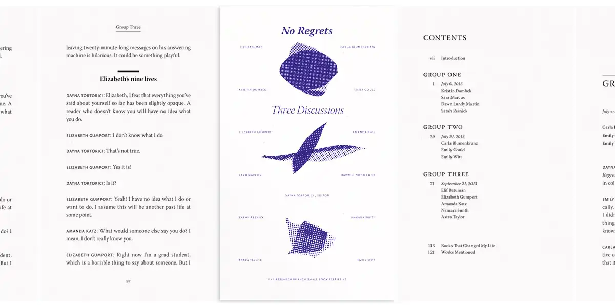
Above: No Regrets book (2014). -
Above: n plus ultra, 10th anniversary tote bags (2014). -
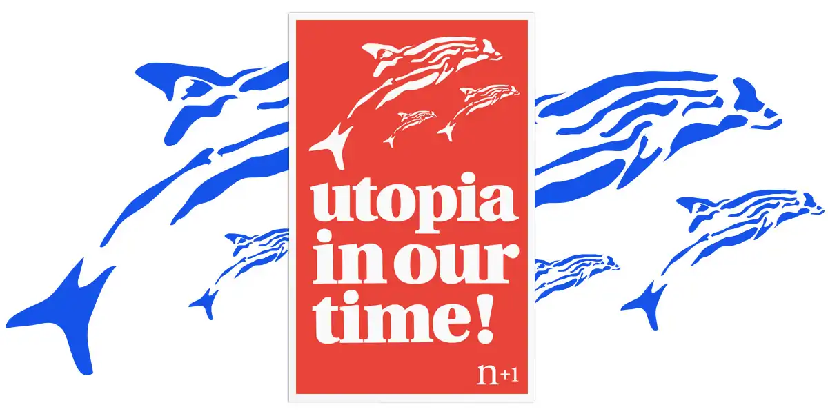
Above: Utopia in Our Time! silksceen poster (2010 and 2015). Typeface: Utopia (modified)
n+1 is a journal of politics, literature, and contemporary thought based in Brooklyn, NY. Their publishing system, developed in 2005, is an idiosyncratic mix of traditional typographic design and colorful abstract illustration. From the beginning, n+1’s primary focus has been its texts. The visual materials are designed to support the writing without overwhelming it — to be distinctive without distraction and to add tone with minimal overhead.