Dano Williams

Dano Williams is a designer in Portland, Oregon.

Selected Projects

2015 Library Innovation Lab website and identity
Front-end development Content strategy Logo design Icons/UI
2015 Perma.cc redesign
Front-end development Web app Content strategy Icons/UI
2015 Free the Law dashboard
Information design Data visualization Icons/UI
2015 Berkman Center for Internet & Society prospectus
Print design Information design Data visualization Icon design
2014 nplusonemag.com site design
Front-end development Content strategy Icons/UI
2005+ n+1 publishing system
Book design Identity Illustration
2014 Emily Books identity and series design
Identity Series Photography

Library Innovation Lab website and identity

  • 2015
  • front-end dev
  • content strategy
  • logo design
  • icons/ui

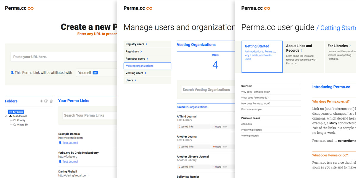
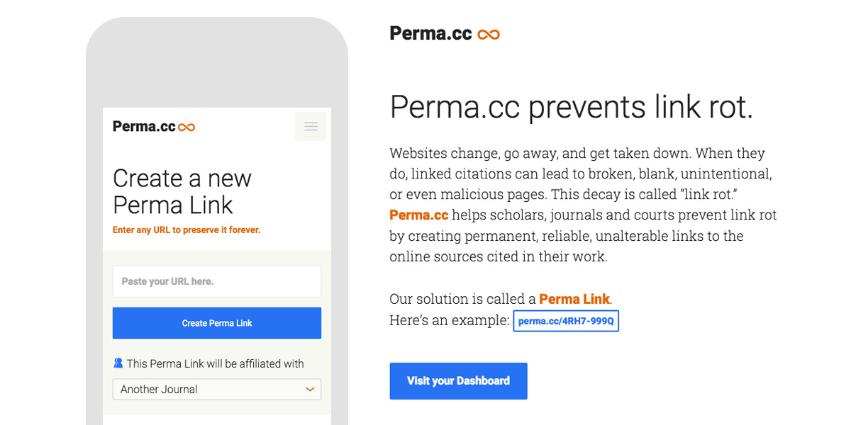
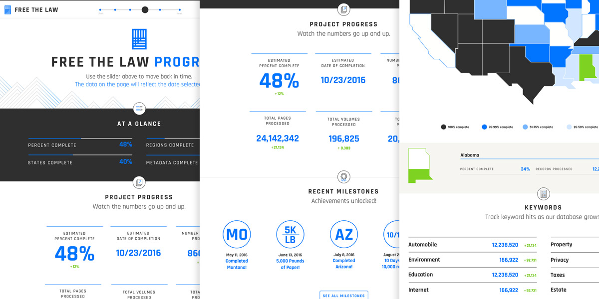
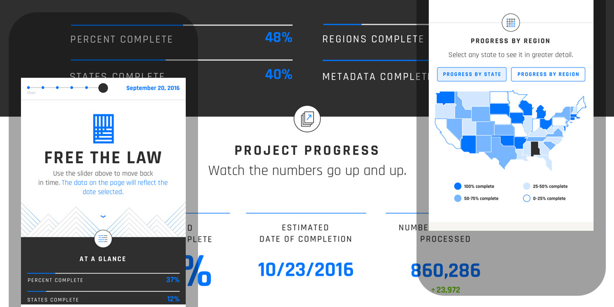
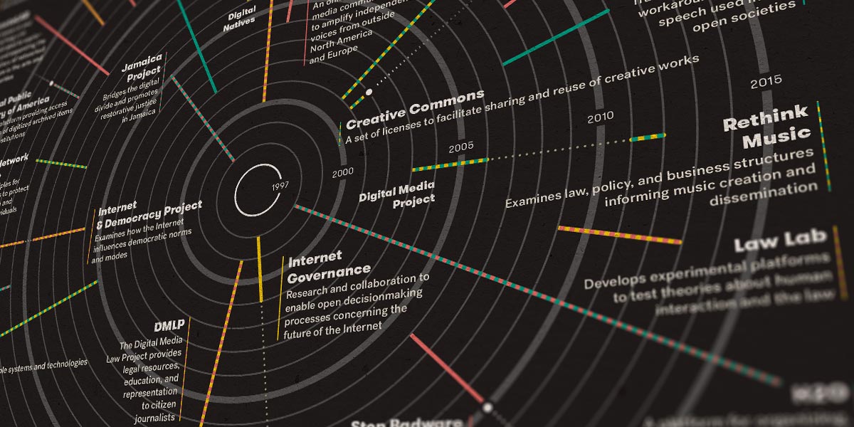
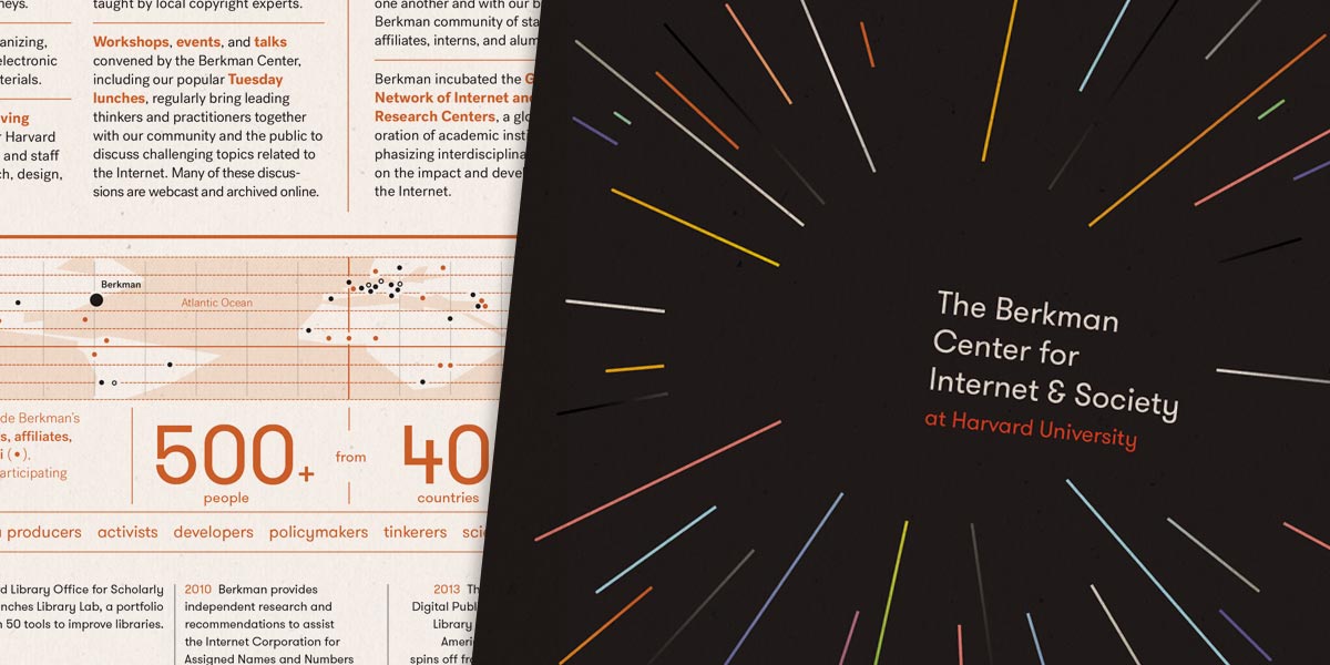
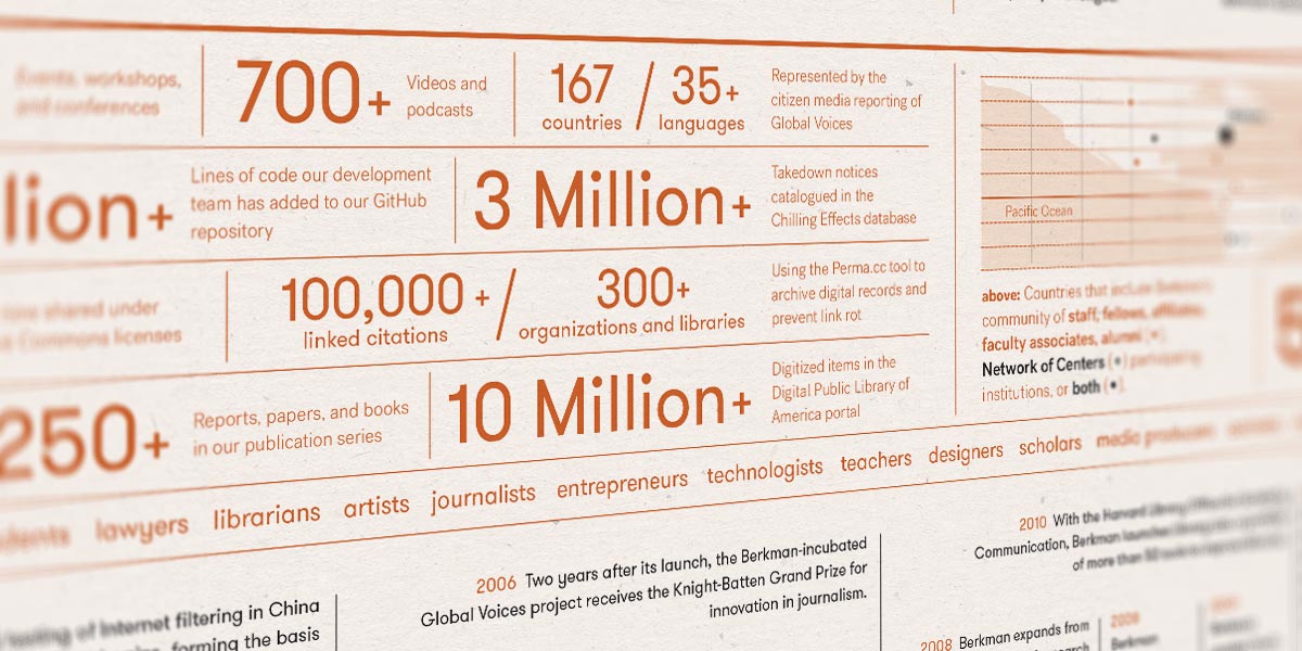
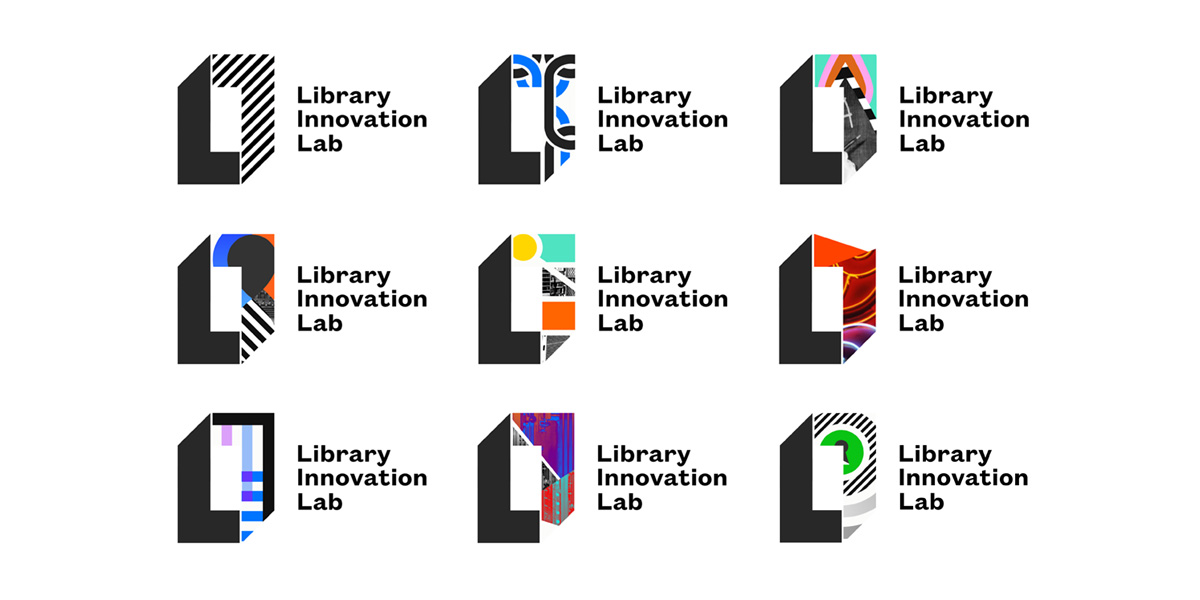
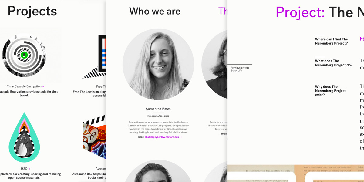
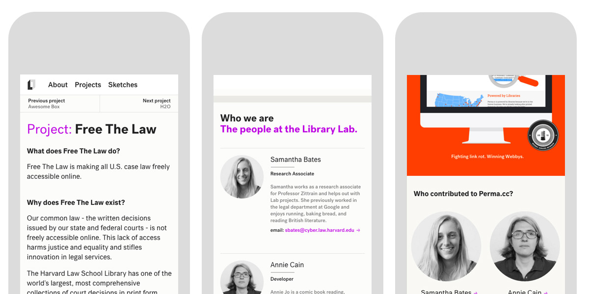
The future doesn’t always have to destroy or disrupt the past. It can build on it, strengthen it, and discover its forgotten strengths and successes as well. Harvard’s Library Innovation Lab is a brilliant example of the critical role for libraries, academia, and other noncommercial institutions of public knowledge in the digital future. I was fortunate to join their smart, passionate team as a Designer-in-Residence for 2015. Together we built a new website and identity system to communicate the Lab’s impressive smarts, vitality, and breadth of accomplishment. Typefaces: Founders Grotesk Text, Post Grotesk

Perma.cc redesign

  • 2015
  • front-end dev
  • web app
  • content strategy
  • icons/ui

Link rot kills academic citations and Perma.cc stops link rot. Harvard’s Library Innovation Lab developed Perma.cc to provide scholars and legal professionals a way to create permanent, reliable, unbreakable links to the digital sources cited in their work. This redesign helped the Lab take a hard look at the Perma.cc’s usability, making the core functionality more consistent and predictable. We looked at the typefaces, colors, and button shapes, but — just as importantly — at the language system at the center of the overall product definition. We built a trustworthy, bulletproof responsive design to take Perma.cc from a promising beta to a polished 1.0 web app. Sneak peek. Typeface: Roboto

Free the Law dashboard

  • 2015
  • information design
  • data visualization
  • icons/ui

Free the Law is the Harvard Law School’s incredibly ambitious program to digitize the entirety of its collection of American case law and make it freely available on the internet. It will digitize over 42,000 volumes and roughly 40 million pages by 2017. The Free the Law dashboard, developed at Harvard’s Library Innovation Lab, would allow project stakeholders to visualize realtime progress across a number of different metrics — by total volume, geography, milestone, and keyword. The dashboard condenses the dynamic, historic scope of Free the Law to the duration of a glance. Typeface: Rajdhani

The Berkman Center for Internet & Society prospectus

  • 2015
  • printed folder
  • data visualization
  • icon design

The Berkman Center for Internet & Society is one of the oldest and most respected insitutions devoted to the study of the Internet and an open web. Creative Commons, Chilling Effects, Wikipedia, and the podcast can all trace their development through the Center. This new prospectus communicates the Berkman Center’s history and values through the motif of a radiant center — both as pure image and as practical infographic — an image of a rigorous, exciting, and limitless academic environment. It lays the conceptual groundwork for the Center’s modern identity and its larger communication strategy. Read a complete case study of this project.Typefaces: GT Walsheim, Post Grotesk.

nplusonemag.com site design

  • 2014
  • front-end dev
  • content strategy
  • ux

2014’s redesign (now nearly three years old) was a fundamental change for n+1: now the canonical version of the magazine is online. The digital-first redesign allowed n+1 to continue its free web-only articles while adding a new paid online subscription level. The new interactive experience was informed by a detailed content strategy that analyzed the components of the publication and a design strategy that put the reading experience first. Typefaces: Adelle, Adelle Sans, Freight Sans.

n+1 publication system

  • 2005+
  • book design
  • identity
  • illustration

n+1 is a journal of politics, literature, and contemporary thought based in Brooklyn, NY. Their publishing system, developed in 2005, is an idiosyncratic mix of traditional typographic design and colorful abstract illustration. From the beginning, n+1’s primary focus has been its texts. Its visual materials are designed to support the writing without overwhelming it — to be distinctive without distraction and to add tone with minimal aesthetic posturing. Typefaces: Versa Sans and Warnock Pro, unless otherwise noted.

Emily Books identity and series design

  • 2014
  • series design

Emily Books publishes ebook editions of all kinds of funny, terrifying, honest, sexy, raw, refined, queer, angry, sweet, and serious voices. The series design for their iOS app allows each title to express its own personality within a rigorous series style. The design had to work well not only at three different aspect ratios, but also had to be legible at the microscopic size of the iOS Newsstand. I redrew the logo to increase its legibility across different sizes and resolutions.Typeface: Calibre.